Filter Aid (Tap title to access)
Filter Aid (Tap title to access, PC only)
Filter Aid (Tap title for link)
This design centers on a "healthy and natural" ethos, targeting young consumers through minimalist aesthetics and intuitive interactions to convey product value. The strategic visual hierarchy highlights key product benefits like low sugar content and natural ingredients, while prominent yet unobtrusive CTAs (Call-To-Actions) drive engagement, all working together to deliver an interface that feels as fresh and authentic as the beverage itself - effortlessly bridging brand values with user expectations through thoughtful, behavior-driven design.
This design centers on a "healthy and natural" ethos, targeting young consumers through minimalist aesthetics and intuitive interactions to convey product value. The strategic visual hierarchy highlights key product benefits like low sugar content and natural ingredients, while prominent yet unobtrusive CTAs (Call-To-Actions) drive engagement, all working together to deliver an interface that feels as fresh and authentic as the beverage itself - effortlessly bridging brand values with user expectations through thoughtful, behavior-driven design.


Minimalist Layout & Clear Hierarchy:
- Ample whitespace and sans-serif typography (e.g., the "FILTER AID FRUIT SODA" headline) emphasize key messaging, eliminating visual clutter and aligning with the brand’s pure, health-conscious identity.
- A fixed top navigation bar (HOME/PRODUCT/ABOUT, etc.) ensures consistency, reducing cognitive load for users.
Vibrant Colors & Natural Imagery:
- "organic fruits" and "spring water" suggest a fresh palette to resonate with youth-driven associations of vitality and freshness.
- High-contrast CTA buttons drive engagement with clear visual cues.
User-Centric Interaction Design:
- Functional entry points (e.g., subscription prompts, membership) are streamlined with concise copy ("Click below to Enjoy"), minimizing decision friction.
- The membership page prioritizes benefit-driven content in a scannable layout, catering to younger users’ preference for efficiency and value.
Sunglasses (Tap title to access)
Sunglasses (Tap title to access, PC only)
Filter Aid (Tap title for link)
This design combines immersive full-screen videos, bold typography, and strategic white space to highlight products while ensuring intuitive navigation. Vibrant color blocks emphasize technical features like UV protection and polarized lenses, maintaining brand consistency.Every element is performance-tuned for buttery-smooth transitions, transforming aesthetic appeal into tangible conversions through intuitive navigation and frictionless checkout flows.
This design combines immersive full-screen videos, bold typography, and strategic white space to highlight products while ensuring intuitive navigation. Vibrant color blocks emphasize technical features like UV protection and polarized lenses, maintaining brand consistency.Every element is performance-tuned for buttery-smooth transitions, transforming aesthetic appeal into tangible conversions through intuitive navigation and frictionless checkout flows.
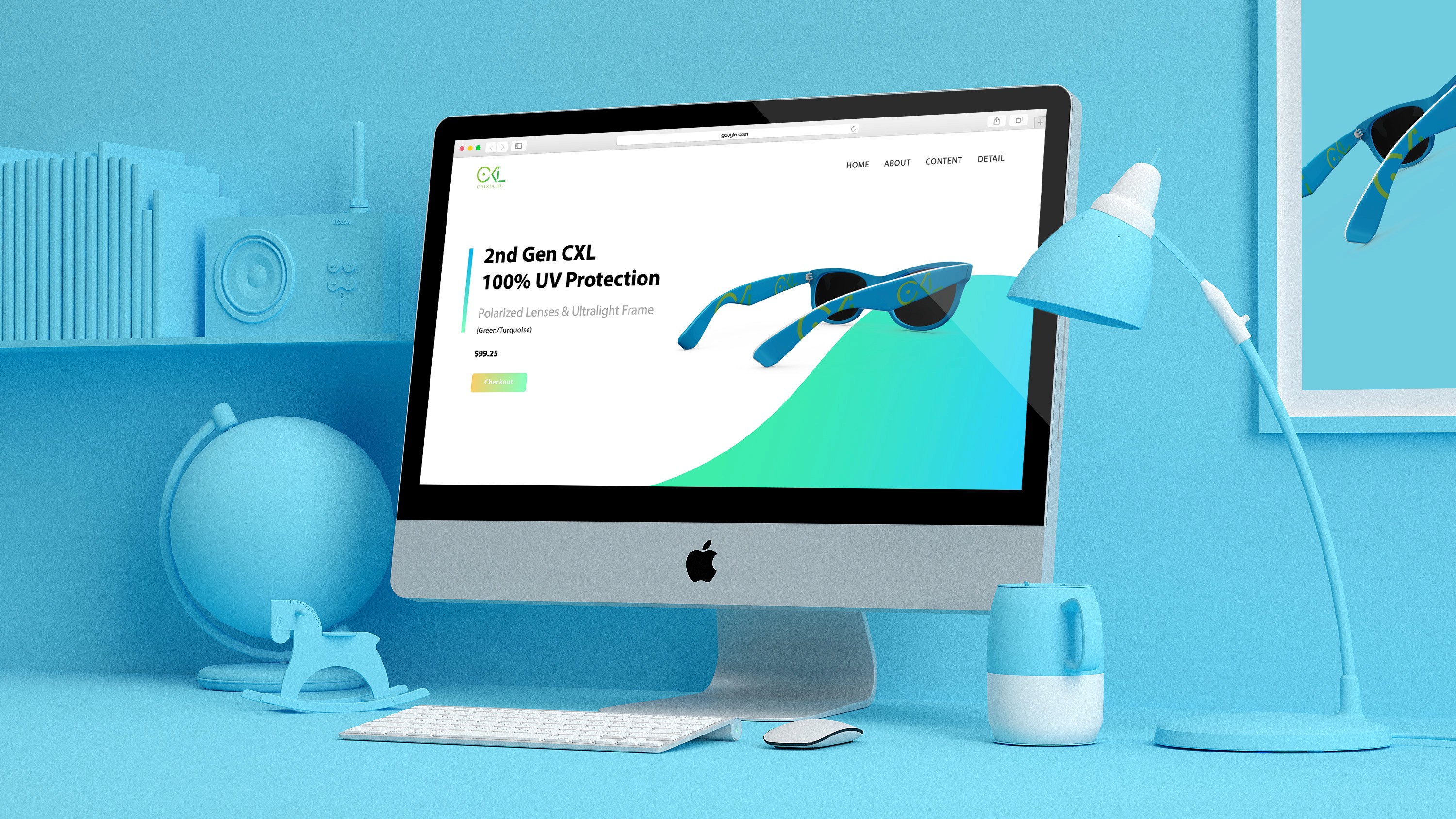


1. Product-Centric UX Strategy
Front-Loaded Key Benefits: Critical features (e.g., "100% UV Protection," "Ultralight Frame") are presented via icons + concise copy, catering to young users' quick-scrolling habits.
Contextual Showcases: The "EYEWEAR TRENDS" section leverages short videos to demonstrate real-life usage, fostering emotional connection.
2. Dynamic Visual Impact
Full-screen dynamic video backgrounds showcasing product wear scenarios enhance fashion appeal
High-contrast color schemes (e.g., fluorescent CTA buttons) create energetic vibes
Minimalist product close-ups balance dynamic elements